
“The app that lets you eat dinner at a stranger's home.”
Bridge
Bridge allows foodies to eat home-cooked meals and experience authentic dining anywhere in the world. While allowing home cooks to earn money hosting or delivering meals to guests.
Project Info
-
UX UI Design
-
User Research
-
Brand Creation and Logo
-
Landing page design
-
App Mockup
-
User Testing
Duration: 6-8 Weeks
Team: Product Designer (me), Project Manager, Front end Software Developer

What the finished product looked like
User Research: The Start of the Design Process
Before diving into design solutions for "Bridge", it was essential to first understand the depth and nuances of the challenges users face. This involved identifying and getting into the shoes of our target audience
To gain valuable insights, we crafted a comprehensive questionnaire, aiming to:
-
Identify pain points in current dining experiences.
-
Gauge interest in a home-cooked meal platform.
-
Understand concerns and hesitations about using such a service.

Gathering Responses
We reached out to a diverse group to ensure a wide variety of perspectives. This included avid travelers, culinary enthusiasts, home cooks, and even restaurant owners.
This helped in:
-
Prioritizing feature design based on user needs.
-
Understanding the gaps in the current market offerings.
-
Highlighting safety and trust as primary concerns to be addressed in the design.

The "Core" Problem.


?
User Personas Based on Interviews:

Sketching the solution
Several core features were identified and sketched out:
a. Meal Exploration Interface: Allowing foodie travelers to easily browse, filter, and select the type of meal experiences they're interested in.
b. Home Cook Profile: A space for home cooks to showcase their culinary skills, tell their story, and list their specialty dishes.
c. Booking & Payment System: An intuitive booking system for travelers and a hassle-free payment gateway ensuring security and convenience for both parties.
d. Review & Rating Mechanism: To build trust and ensure quality, users can leave reviews and rate their experiences..

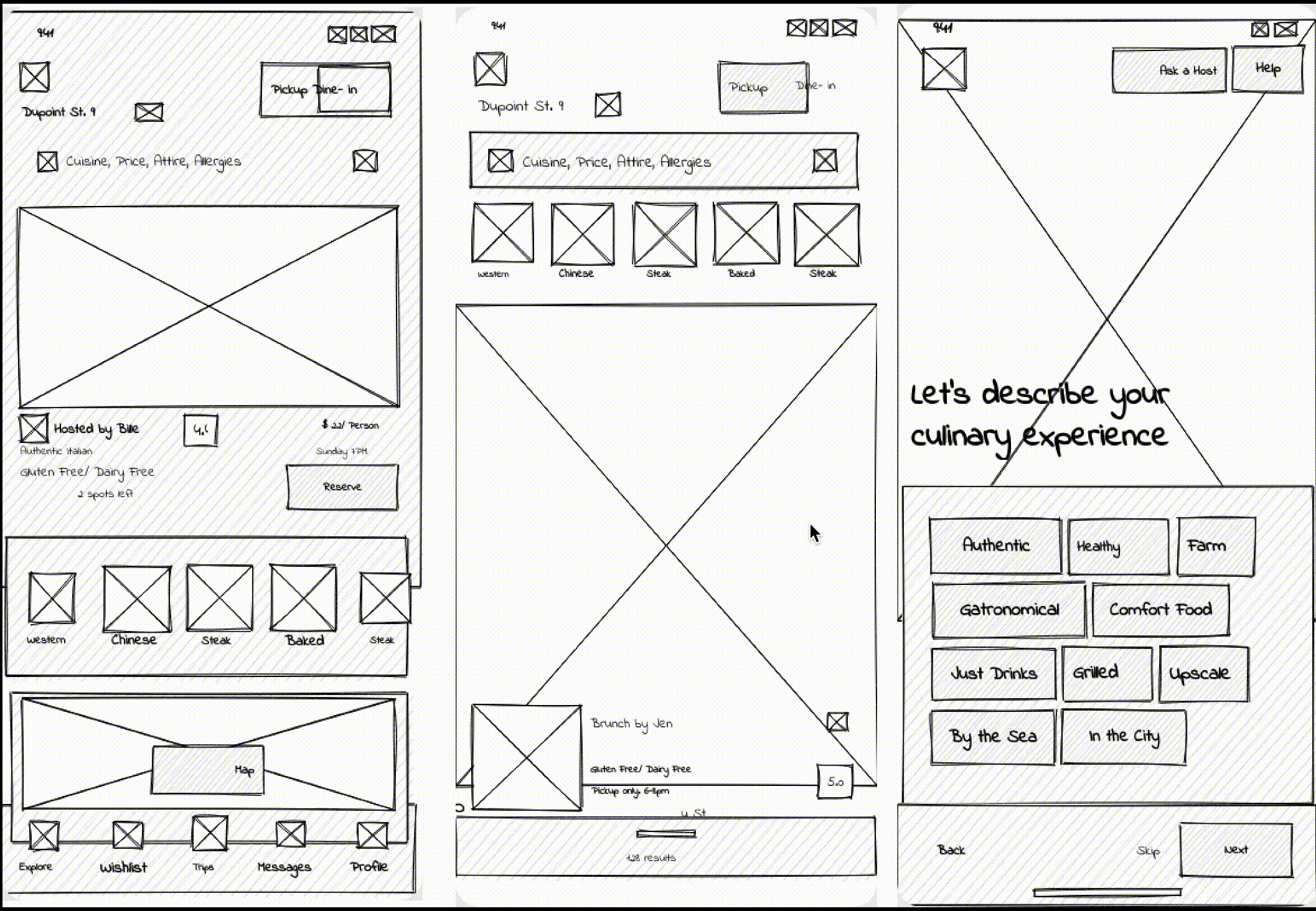
Low Fidelity Modeling

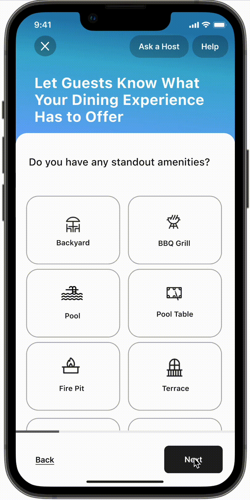
Swift & Streamlined Onboarding: Welcoming Our Hosts
To ensure a frictionless start for our hosts on "Bridge", the onboarding process was designed to be both efficient and comprehensive.
1. Time-Efficient Profile Setup: Recognizing the value of our hosts' time, we optimized the setup to be completed in just 15-20 seconds. This rapid process ensures hosts can get started without delays, fostering a positive initial experience.
2. Progress Indicators: To guide our hosts through the setup, clear progress indicators were incorporated. These not only give a sense of achievement but also provide clarity on the remaining steps, minimizing drop-offs.
3. Prioritizing Essential Information: Understanding the critical balance between brevity and thoroughness, we mapped out the most vital details needed from our hosts. This ensures that guests have enough information for a comfortable dining experience while not overwhelming hosts during signup.
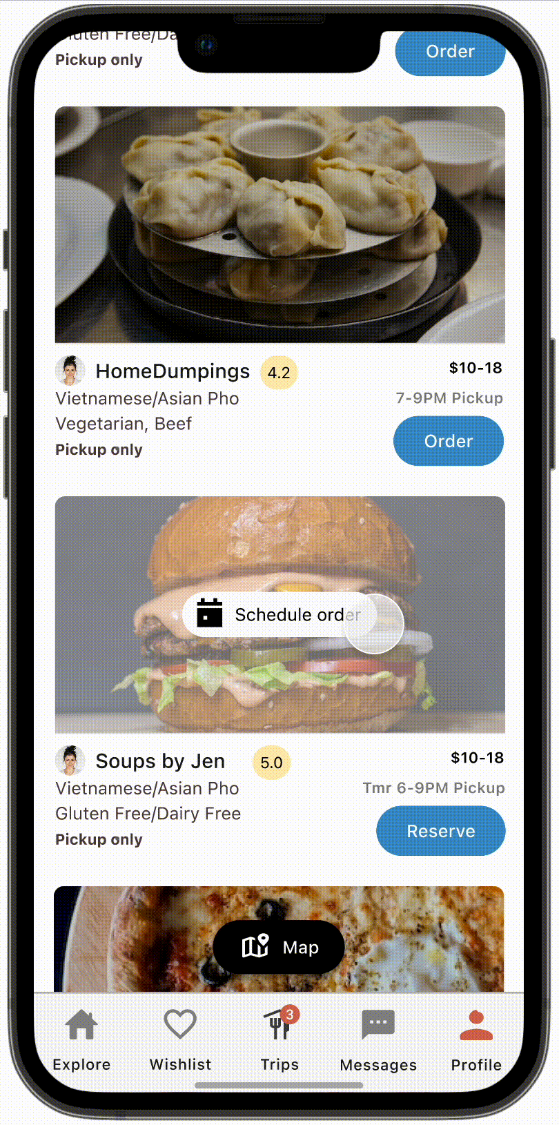
Homepage Design: Intuitive Color-Coded Interface
The homepage was crafted with distinct visual cues, facilitating effortless navigation between the two primary options: Pickup Food and Dine In.
1. Color-Coded Actions:
-
Pickup Food: All action buttons associated with this option are rendered in blue. This choice not only highlights its prominence but also provides a clear visual path for users seeking this service.
-
Dine In: Switching to the Dine In mode introduces red action buttons.
2. Effortless Switching: By associating each option with a unique color, users can instinctively navigate and toggle between Pickup Food and Dine In, ensuring they engage with their desired service efficiently.
High Fidelity Flows
These are high-fidelity screens for the login processes, the home screen, and various filters as well as the onboarding screens for home cooks

Lessons Learned:
-
Feedback is Gold: Early and continuous user feedback often shines a light on aspects that may have been overlooked. It reinforces the idea that design, at its heart, is a collaborative process.
-
Simplicity is Key: While the temptation to add multiple features and elements is ever-present, it’s the pursuit of simplicity that often leads to a more user-friendly product.
Things I'd Do Differently:
-
Early Prototyping: While our design was informed by initial user research, rapid prototyping in the early stages could have provided quicker insights into potential challenges and solutions.
-
Diverse User Testing: Engaging a more diverse test group could have unveiled a broader range of user perspectives and needs, further enriching the final design.
Moving forward: